

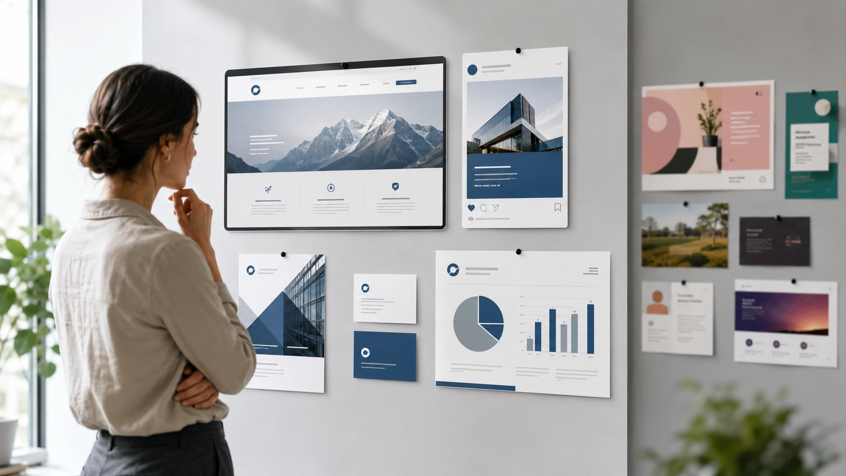
A business can have a good logo and still look inconsistent.
The website may use one set of colours, social media posts may use another, and quotations or brochures may follow a completely different style.
When these materials do not feel connected, the business becomes harder to recognise.
Brand consistency comes from using the same visual and communication system across every touchpoint.
It does not mean every item must look identical.
It means each item should feel like it belongs to the same business.
What is brand consistency?
Brand consistency is the repeated and coordinated use of the same brand elements across different platforms and materials.
These elements may include:
- Logo
- Colours
- Typography
- Imagery
- Graphic style
- Tone of voice
- Layout principles
- Messaging
- Calls to action
Consistency helps customers connect separate experiences back to the same brand.
A website, social media post, proposal and name card may serve different purposes, but they should still share a recognisable visual language.
Why brand consistency matters
People usually encounter a business more than once before deciding to enquire or buy.
They may first see:
- A social media post
- A Google advertisement
- A website
- A quotation
- A brochure
- A business profile
- A physical sign
- An email signature
If every touchpoint looks different, the customer may not immediately realise that they belong to the same business.
Consistency helps build:
Recognition
Repeated use of the same colours, logo and style makes the business easier to remember.
Trust
A coordinated visual presence can make the business feel more organised and dependable.
Clarity
Consistent design helps customers understand what information belongs together.
Efficiency
The business does not need to redesign every new item from the beginning.
Professionalism
A clear system helps different materials feel intentional rather than improvised.
Consistency is not only a design issue.
It supports how the business is perceived over time.
The role of the logo
The logo is usually the most recognisable part of a brand, but consistency depends on how it is used.
A practical logo system may include:
- Primary logo
- Secondary logo
- Brand mark
- Monochrome version
- Reversed version
- Minimum size guidance
- Clear-space rules
Problems appear when:
- The logo is stretched
- Colours are changed randomly
- Different versions are used without purpose
- The logo becomes too small
- Background contrast is poor
- Low-quality files are used
Consistent logo use helps every material feel connected.
However, the logo should not be forced into every empty space.
It should appear clearly and appropriately.
Using a consistent colour system
Colour is one of the fastest ways to create recognition.
A brand colour system may include:
- Primary colours
- Secondary colours
- Neutral colours
- Accent colours
- Background colours
- Text colours
Each colour should have a practical role.
For example:
- Primary blue for headings and buttons
- Dark navy for important text
- Light grey for backgrounds
- Accent colour for highlights
- White for open space
Consistency does not mean using every brand colour in every design.
It means using the colours according to a shared system.
Too many colours can weaken recognition and make the brand feel unsettled.
Keeping typography consistent
Typography influences how the brand feels and how easy its content is to read.
A typography system may define:
- Heading font
- Body font
- Font weights
- Font sizes
- Line spacing
- Capitalisation
- Alignment
- Letter spacing
The same type system should be used across:
- Website pages
- Social media
- Presentations
- Brochures
- Proposals
- Advertisements
- Business documents
Using many unrelated fonts can make the business feel fragmented.
A simple system with one or two well-chosen typefaces is usually easier to maintain.
Creating a clear image direction
Images also form part of the brand.
A business may choose a consistent photography direction based on:
- Lighting
- Composition
- Colour tone
- Subject matter
- Background style
- People or no people
- Camera angle
- Level of formality
For example, a brand may consistently use:
- Bright natural daylight
- Clean office environments
- Real people working
- Neutral interiors
- Minimal compositions
- Blue and grey accents
Another brand may use bold colours, dramatic lighting and highly energetic scenes.
Neither direction is automatically better.
The important thing is that the imagery supports the brand personality and remains consistent.
Maintaining a consistent tone of voice
Brand consistency is not only visual.
The words used by the business should also feel connected.
Tone of voice may affect:
- Website copy
- Social media captions
- Emails
- Advertisements
- Proposals
- Customer messages
- Frequently asked questions
- Calls to action
A business may choose to sound:
- Professional
- Approachable
- Practical
- Direct
- Premium
- Friendly
- Technical
- Reassuring
The tone can adjust slightly depending on the situation, but the underlying personality should remain recognisable.
For example, a formal quotation can still sound like the same business as a casual social media post.
Applying the brand across different touchpoints
A strong brand system should work across both digital and physical materials.
Website
The website should reflect the approved colours, typography, imagery and tone.
Social media
Posts should use consistent visual templates, image direction and messaging.
Business documents
Quotations, invoices and proposals should follow the same brand system.
Advertising
Campaign creative should feel connected to the website and other brand materials.
Email signatures, newsletters and automated messages should use consistent wording and presentation.
Name cards, brochures, flyers and signage should use the same visual direction.
Physical environment
Uniforms, vehicles, packaging and office materials may also support the brand.
Consistency becomes stronger when the customer moves from one touchpoint to another without feeling that they have entered a different business.
Common causes of brand inconsistency
Brand inconsistency often develops gradually.
No clear brand guidelines
Without documented rules, different people make different decisions.
Too many designers or suppliers
When several people create materials without coordination, the brand may drift.
Outdated files
Old logos, colours or templates may continue being used.
Random social media design
Posts may follow trends instead of the established brand system.
Frequent visual changes
The business may change fonts, colours or styles too often.
Poor file organisation
Team members may not know which logo or template is current.
No content direction
The visual design may be consistent, but the tone and messaging may change from platform to platform.
Unplanned growth
As the business adds services and channels, the original brand system may no longer be enough.
The solution is not always a full rebrand.
Sometimes the business simply needs clearer rules and better organisation.
How to improve an inconsistent brand
Start by reviewing the materials the business already uses.
Collect examples of:
- Website pages
- Social posts
- Advertisements
- Quotations
- Presentations
- Name cards
- Brochures
- Email signatures
- Packaging
- Signage
Place them together and ask:
- Do they use the same logo?
- Are the colours consistent?
- Are the fonts related?
- Does the image style feel connected?
- Is the tone similar?
- Are the calls to action aligned?
- Do outdated versions still appear?
Then define the core system.
This may include:
- Confirming the current logo files
- Finalising the colour palette
- Selecting typography
- Defining image direction
- Clarifying tone of voice
- Creating reusable templates
- Organising approved files
- Documenting simple usage rules
The system should be practical enough for everyday use.
A practical brand consistency checklist
Before publishing or producing a new item, ask:
- Is the correct logo being used?
- Are the colours part of the approved palette?
- Are the fonts consistent with the brand?
- Does the image style match existing materials?
- Does the tone sound like the same business?
- Is the message clear?
- Are the buttons and calls to action consistent?
- Does the item connect visually to the website?
- Are outdated templates being avoided?
- Could a customer recognise the brand without seeing the full company name?
If several answers are unclear, the brand system may need refinement.
Conclusion
A consistent brand is built through repetition, coordination and clear rules.
The logo matters, but it is only one part of the system.
Colours, typography, imagery, layout, messaging and tone all contribute to how the business is recognised.
Consistency does not mean every item should look identical.
It means every item should feel connected.
When the brand is applied clearly across different touchpoints, the business becomes easier to recognise, easier to trust and easier to manage.
Does your brand feel disconnected?
Radiix helps businesses create clearer brand systems that work across websites, marketing materials, social content and everyday business use.
Explore Brand Identity & Design
View Brand Packages
Explore Website Design
Explore Copywriting & Content Creation
Talk to Radiix on WhatsApp